Galaxy Client Architecture
Learning Questions
- How is the Galaxy UI built?
- What frontend technologies does Galaxy use?
- How do I develop and test the client?
Learning Objectives
- Understand the client build process
- Learn about Vue.js and Vuex
- Navigate the client source code
- Run client tests and development servers
Client Architecture
The architecture of Galaxy’s web user interface.
Client Directories
- Source JavaScript for the client is in
client/src. - Source stylesheets are in
client/src/style. - “Packed” bundles served by Galaxy stored in
static/distrun.shusesgit diffto try to determine if client needs to be built before starting Galaxy- webpack builds these “compiled” artifacts
Upshot - to develop against the client, modify files in client/ and rebuild with make client before
deployment.
Building the Client - Makefile Targets
client: node-deps ## Rebuild all client-side artifacts (for local dev)
  cd client && yarn run build

client-production-maps: node-deps ## Build optimized artifacts with sourcemaps.
  cd client && yarn run build-production-maps

client-watch: node-deps ## Rebuild client on each change.
  cd client && yarn run watch

client-format: node-deps ## Reformat client code
  cd client && yarn run prettier

client-lint: client-eslint client-format-check ## ES lint and check format of client

client-test: node-deps  ## Run JS unit tests
  cd client && yarn run test

client-test-watch: client ## Watch and run all client unit tests on changes
  cd client && yarn run jest-watch

node-deps: ## Install NodeJS and dependencies.
Automatically Reloading During Development
The following command rebuilds the application on each change.
make client-watchThis is still a relatively slow process, an extra client development server can be started that proxies non-client requests to your Galaxy server and selectively reloads only what is needed during active development (hot module replacement or HMR).
make client-dev-serverMake sure to open Galaxy at http://localhost:8081 instead to point at the client proxy.

webpack in Galaxy
Packs and “transpiles” Galaxy ES6 code (.js), Galaxy Vue modules (.vue), libraries from npm, scss stylesheets (.scss) into browser native bundles.
Hundreds of high-level well organized files into optimized single files that can be quickly downloaded.
Lots of active development and complexity around Viz plugins and dependencies for instance, but the webpack configuration file in config/webpack.config.js is fairly straightforward.
Stylesheets
- Galaxy shared stylesheets are generally defined using the SCSS syntax
- SCSS is a high-level superset of CSS - https://sass-lang.com/documentation/syntax
sassis leveraged by webpack to convert these styles to native CSS at client build time- Rebuild style with
make style - Galaxy’s SCSS files can be found in
client/src/style/scss/
Package and Build Files

Source Files

ES6
The client is built from JavaScript source files. We use ES6 JavaScript.
A tutorial to help learn JavaScript generally might be https://www.w3schools.com/js/.
For someone familiar with JavaScript but that wants a primer on the new language features in ES6, https://www.w3schools.com/js/js_es6.asp may be more appropriate.
Vue
Vue.js is a reactive framework for building web client applications.
We chose Vue.js over React initially because of its focus on allowing developers to incrementally or progressively replace pieces of complex existing applications.
The idea behind Vue.js is fairly simple to pick up and there is a lot of great tutorials and videos available. https://vuejs.org/v2/guide/ is a really good jumping off point.
Pinia
Pinia is a state management library for Vue.js. It provides stores as the central source of truth, with a simpler, more intuitive API compared to earlier solutions. It supports Vue 2 and Vue 3 with Composition API.
Key features include devtools integration, hot module replacement, type-safe stores, and seamless TypeScript support.
Client Unit Tests
Configured in client/src/jest/jest.config.js.
Vue tests are placed beside components in client/src, more tests in client/test/qunit/tests and client/test/jest/standalone/.
Vue Test Utils
Vue Test Utils is the official unit testing utility library for Vue.js.
https://vue-test-utils.vuejs.org/
Really nice reference library documentation. A lot of helpers and concepts to unit test Vue components.
Client Unit Test Design Tips
https://github.com/galaxyproject/galaxy/tree/dev/client/docs/src/component-design/unit-testing
- Clearly document the intent of your test
- Implement logic in pure functions when possible
- Wrap native browser resources in a function so they can be easily mocked
Webhooks in Galaxy
Webhooks is a system in Galaxy which can be used to write small JS and/or Python functions to change predefined locations in the Galaxy client.
In short: A plugin infrastructure for the Galaxy UI
.footnote[You can learn more about webhooks using our webhook [training]({% link topics/dev/tutorials/webhooks/slides.html %}).]
Webhook masthead example
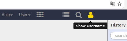
At the header menu: Enabling the overlay search, link to communities …
.footnote[You can learn more about webhooks using our webhook [training]({% link topics/dev/tutorials/webhooks/slides.html %}).]
Webhook tool/workflow example
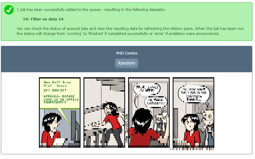
Shown after tool or workflow execution. Comics, citations, support …
.footnote[You can learn more about webhooks using our webhook [training]({% link topics/dev/tutorials/webhooks/slides.html %}).]
Webhook history-menu example
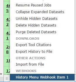
Adds an entry to the history menu - no functionality as of now
Galaxy Component Library
Galaxy is replacing Bootstrap-Vue with custom components:
- Reduce dependency - Prepare for framework upgrades
- Improve consistency - Unified design language
- Enhance accessibility - Built-in a11y
- Simplify maintenance - Galaxy-specific needs
The Galaxy client historically used Bootstrap-Vue for UI components. As Bootstrap-Vue’s maintenance slowed and Galaxy’s needs became more specific, the team began building a custom component library.
The library lives in two locations:
client/src/components/BaseComponents/- Core interactive components (GButton, GLink, GModal)client/src/components/Common/- Higher-level reusable components (GCard)
Deprecated BootstrapVue Components
Do not use these in new code:
| BootstrapVue | Use Instead |
|---|---|
BButton, b-button | GButton |
BLink, b-link | GLink |
BModal, b-modal | GModal |
BCard, b-card | GCard |
Existing usages should be migrated when touching related code.
Component Migration Reference
When writing new Vue components or modifying existing ones, always prefer Galaxy’s custom components over their Bootstrap-Vue equivalents.
GButton replaces BButton
<!-- ❌ Deprecated -->
<BButton variant="primary" size="sm" :disabled="busy">Submit</BButton>

<!-- ✅ Use instead -->
<GButton color="blue" size="small" :disabled="busy">Submit</GButton>
Key differences:
variant→color(grey, blue, green, yellow, orange, red)size="sm"→size="small"(small, medium, large)- Built-in tooltip support via
tooltipprop - Polymorphic: renders as
<button>,<a>, or<router-link>based on props
See: client/src/components/BaseComponents/GButton.vue
GLink replaces BLink
<!-- ❌ Deprecated -->
<BLink href="#" @click="doSomething">Click here</BLink>

<!-- ✅ Use instead -->
<GLink @click="doSomething">Click here</GLink>
See: client/src/components/BaseComponents/GLink.vue
GModal replaces BModal
<!-- ❌ Deprecated -->
<BModal v-model="showModal" title="Confirm" ok-only>Content</BModal>

<!-- ✅ Use instead -->
<GModal v-model:show="showModal" title="Confirm" confirm>Content</GModal>
Key differences:
- Uses native
<dialog>element for better accessibility v-model→v-model:showok-only→confirm
See: client/src/components/BaseComponents/GModal.vue
GCard replaces BCard and custom card layouts
<!-- ❌ Deprecated custom layout -->
<div class="workflow-card">
  <div class="card-header"><h3>{{ name }}</h3></div>
  <div class="card-body">{{ description }}</div>
</div>

<!-- ✅ Use instead -->
<GCard :id="id" :title="name" :description="description" />
GCard provides a comprehensive props-driven API with support for actions, badges, indicators, tags, bookmarks, and selection state.
See: client/src/components/Common/GCard.vue
Component Migration Effort
Migration strategy:
- New code - Always use Galaxy components
- Modified code - Migrate when touching files
- Batch migrations - Periodic focused efforts
Reference PRs:
Migration Effort
The component library migration is ongoing and incremental. Bootstrap-Vue and Galaxy components coexist during the transition.
Finding Components to Migrate
# Find BButton usages
grep -r "BButton\|b-button" client/src --include="*.vue"

# Find BModal usages
grep -r "BModal\|b-modal" client/src --include="*.vue"
Coexistence with Bootstrap
- Some Galaxy components (GCard) still use Bootstrap internally for badges/dropdowns
- CSS may use
!importantto override Bootstrap styles where needed - Gradual migration allows testing without breaking changes
Component Library Patterns
- Polymorphic - Same API for button, anchor, router-link
- Integrated tooltips - Built-in via
title+tooltipprops - Semantic colors -
blue,red,greennot Bootstrap variants - Composable internals - Shared logic in composables
Component Library Patterns
Polymorphic Components
GButton and GLink render as different HTML elements based on props:
<GButton @click="action">Button</GButton>     <!-- <button> -->
<GButton href="/page">Anchor</GButton>        <!-- <a> -->
<GButton to="/route">Router Link</GButton>    <!-- <router-link> -->
See: client/src/components/BaseComponents/composables/clickableElement.ts
Integrated Tooltips
<!-- ❌ Bootstrap-Vue (directive) -->
<BButton v-b-tooltip.hover title="Click me">Button</BButton>

<!-- ✅ Galaxy (integrated prop) -->
<GButton tooltip title="Click me">Button</GButton>
See: client/src/components/BaseComponents/GTooltip.vue
Semantic Colors
Available colors: grey (default), blue, green, yellow, orange, red
See: client/src/components/BaseComponents/componentVariants.ts
Creating a Component Wrapper
Follow established patterns:
- Use
ComponentColorandComponentSizetypes - Integrate tooltips via
title/tooltipprops - Use shared composables for common logic
- Apply CSS custom properties for theming
- Include ARIA attributes for accessibility
See existing components in client/src/components/BaseComponents/
Creating a New Component Wrapper
Key Files to Reference
- Type definitions:
client/src/components/BaseComponents/componentVariants.ts - Shared composables:
client/src/components/BaseComponents/composables/clickableElement.ts- Determines element type from propscurrentTitle.ts- Handles disabled title switching
- Tooltip integration:
client/src/components/BaseComponents/GTooltip.vue
Standard Props Pattern
import type { ComponentColor, ComponentSize } from "./componentVariants";

interface Props {
  color?: ComponentColor;       // grey, blue, green, yellow, orange, red
  size?: ComponentSize;         // small, medium, large
  disabled?: boolean;
  title?: string;
  disabledTitle?: string;
  tooltip?: boolean;
}
CSS Custom Properties
Use Galaxy’s design tokens:
.g-component {
  padding: var(--spacing-2);
  font-size: var(--font-size-medium);
  background-color: var(--color-grey-100);
}
Accessibility
- Use semantic HTML elements (
<button>,<dialog>) - Include
aria-disabled,aria-describedby - Support keyboard navigation
- Use GTooltip for accessible hover text
Future Component Work
Likely next components based on Bootstrap-Vue usage:
- GAlert - Notification banners
- GDropdown - Dropdown menus
- GTable - Data tables with sorting
- GTabs - Tab navigation
- GCollapse - Collapsible sections
Key Takeaways
- Source in
client/src, built bundles instatic/dist - Webpack handles bundling and transpilation
- Vue.js for reactive components
- ES6 JavaScript
- Jest for unit testing
- Webhooks for UI plugins